campaigns
*
campaigns *
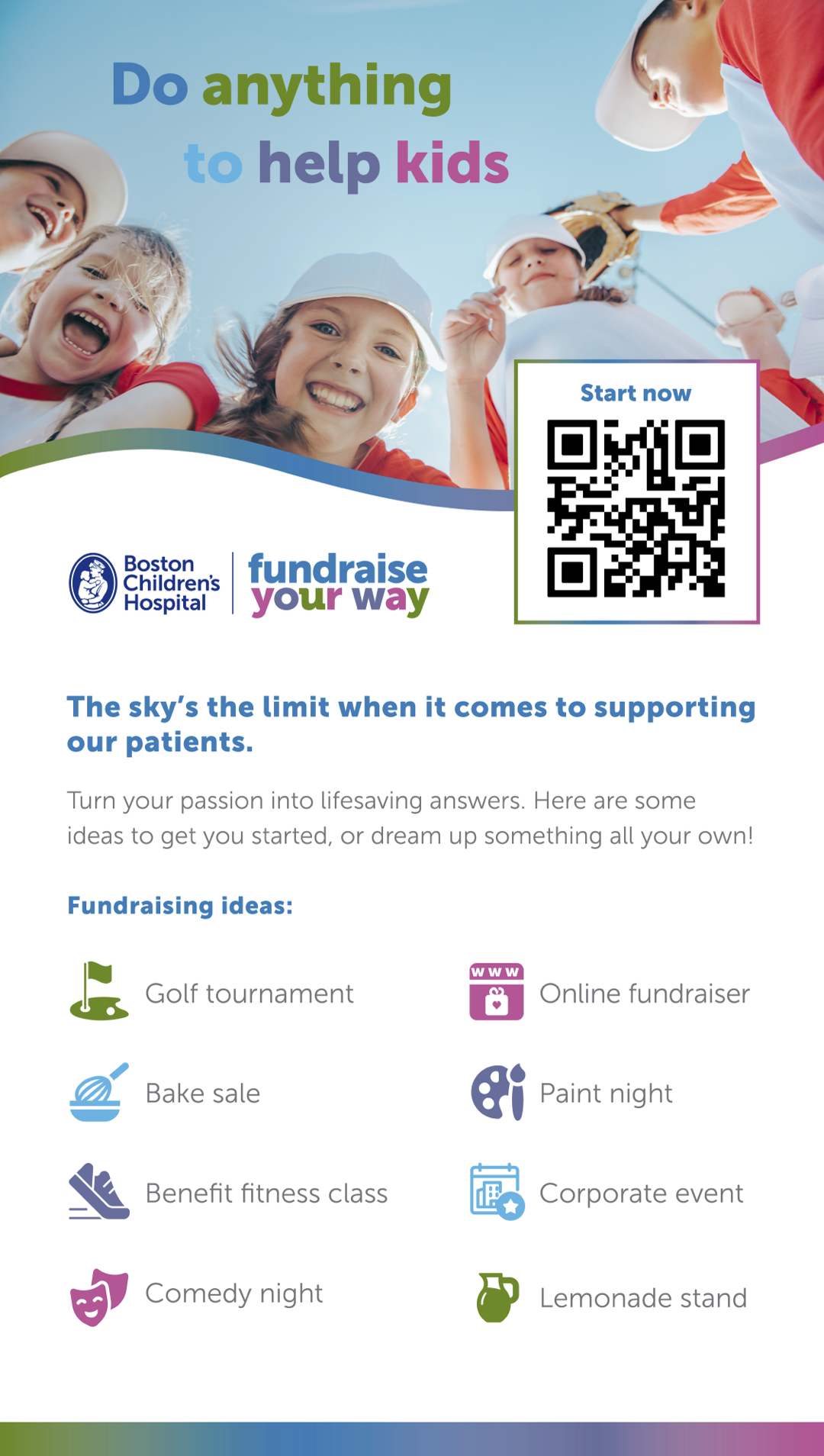
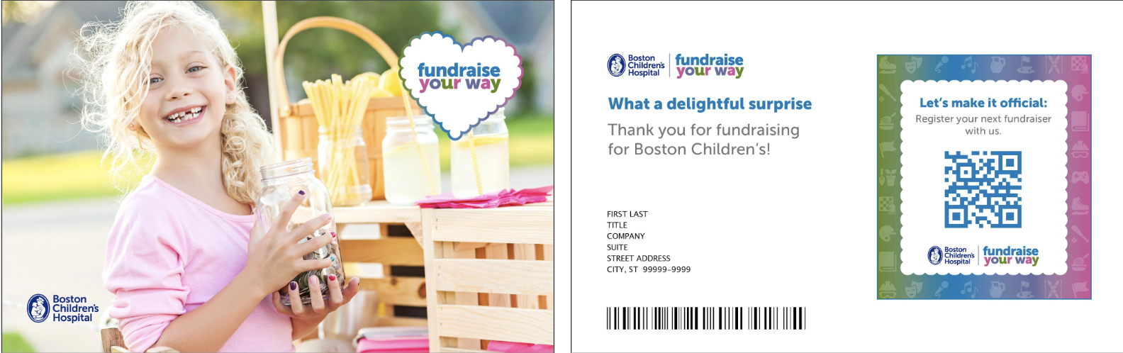
Fundraise Your Way Boston Children’s Hospital Trust
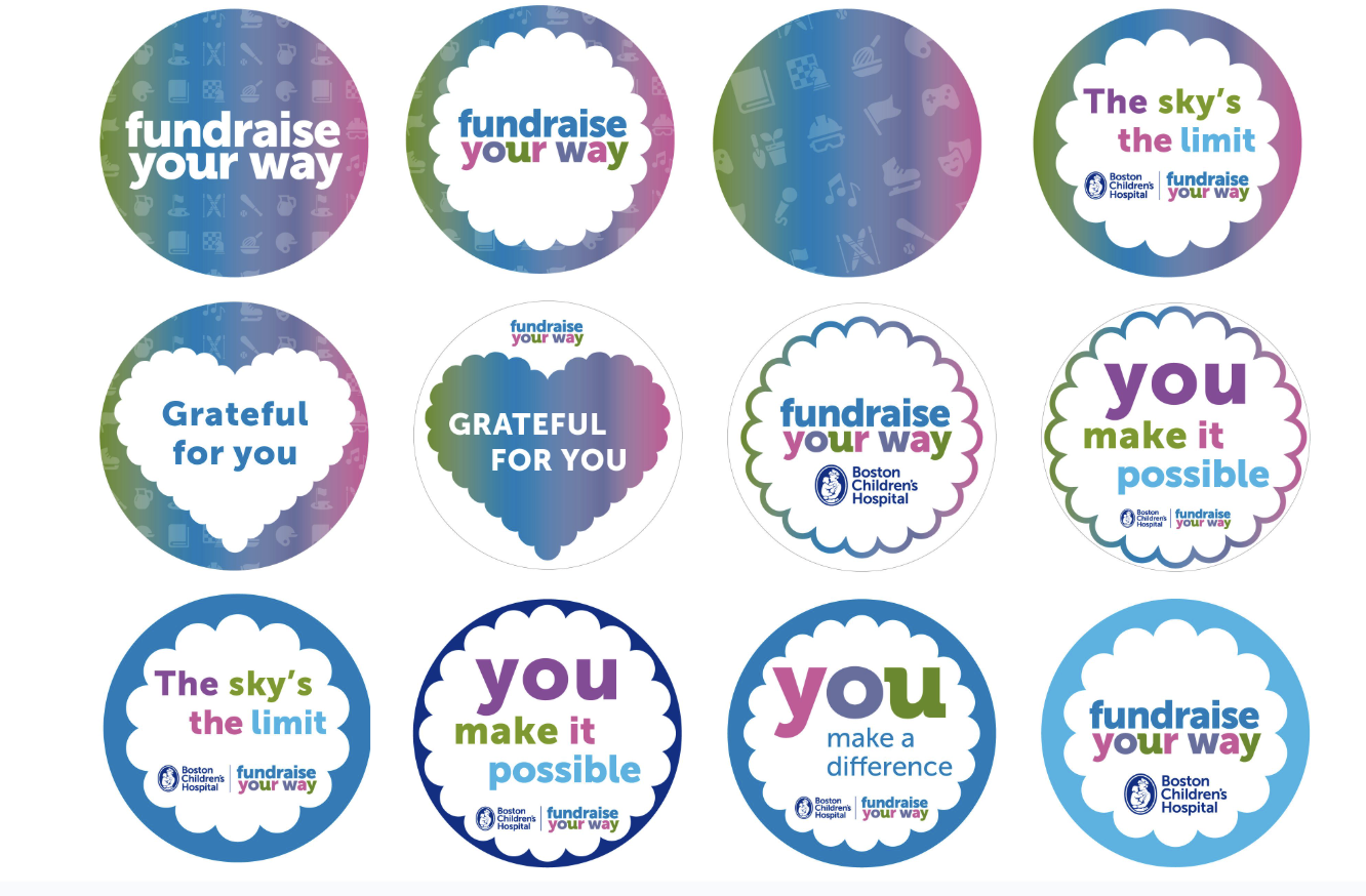
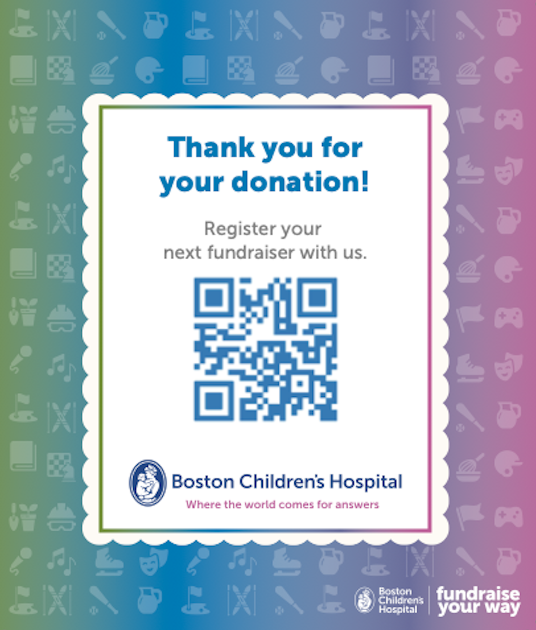
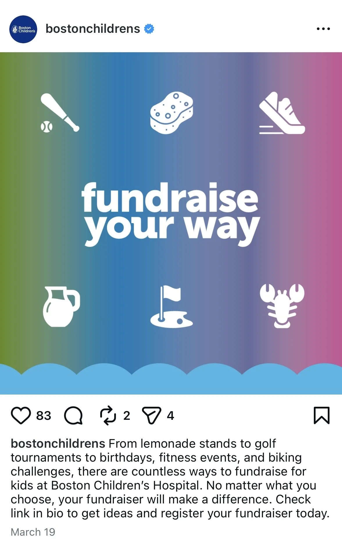
The Boston Children’s Hospital Trust, the philanthropic arm of Boston Children’s Hospital, wanted an overhaul of their peer-to-peer fundraising program, a platform that empowers supporters to raise money for the hospital in whatever way feels most meaningful to them. The new identity needed to strike the right balance — warm, accessible, and energizing enough to inspire everyday supporters, while still reflecting the credibility and seriousness of the world's top pediatric hospital.
I led the charge with a visual direction and all copy for a suite of printed and digital assets, including table tents and a sticker sheet for use at events, a thank you postcard, a reminder magnet, a social template, and website rewrite.
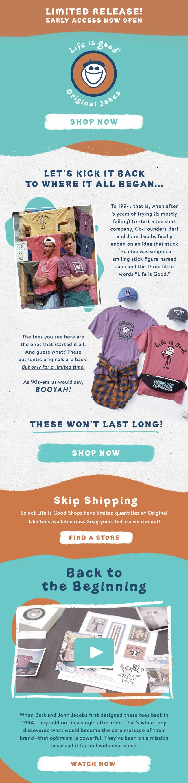
The Original Jakes Life is Good
After years of fielding requests from customers, Life is Good brought back their original t-shirt graphics from the ‘90s. The graphics that started the brand almost 30 years prior and began as doodles on a piece of scrap paper. The goal: Drum up excitement for the limited-edition throwback capsule. My job: Write copy that felt nostalgic but not sentimental, and heritage-obsessed without alienating new customers who'd never met the original Jake. The result: A collection that sold out in a single weekend.
I wrote the full campaign — web, email, product descriptions, social, and in-store — threading a single story across every touchpoint.
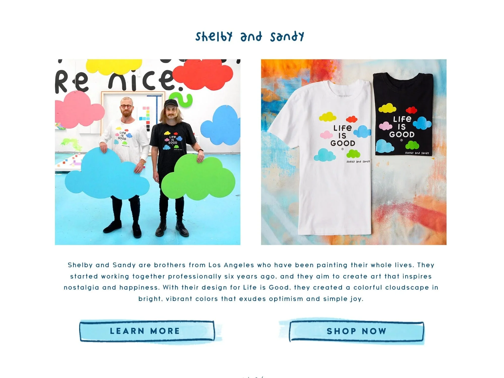
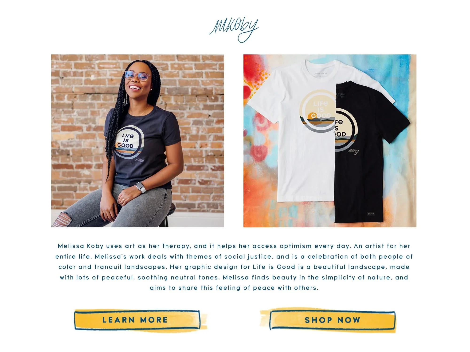
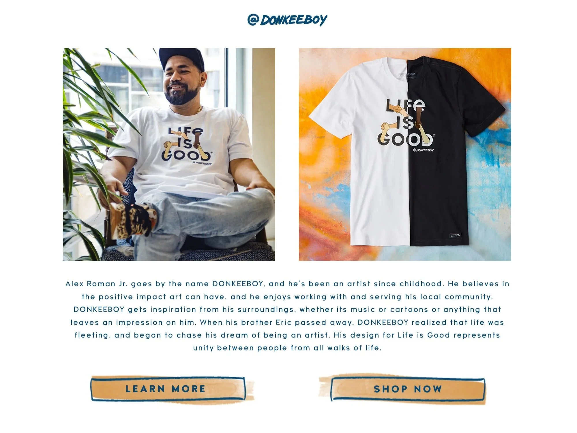
The Artist Series Life is Good
At the height of the pandemic, Life is Good was wondering how to talk to their customers: How to get people to focus on the good stuff when the news seemed so bad every day.
After decades of working with only in-house artists, the brand brought in a community of creators to demonstrate the myriad ways that optimism, their most important brand pillar, could be lived through art.
I interviewed the artists and, based on our conversations and on their work, wove a coherent story that felt true to their individual mediums and styles. I wrote all web, email, blog, and social copy — each one its own story, all of them part of one.
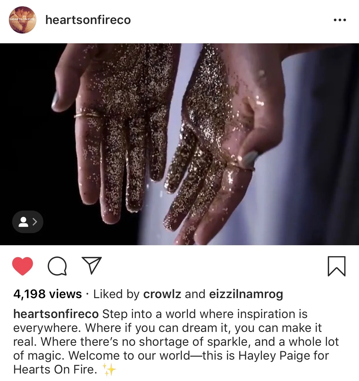
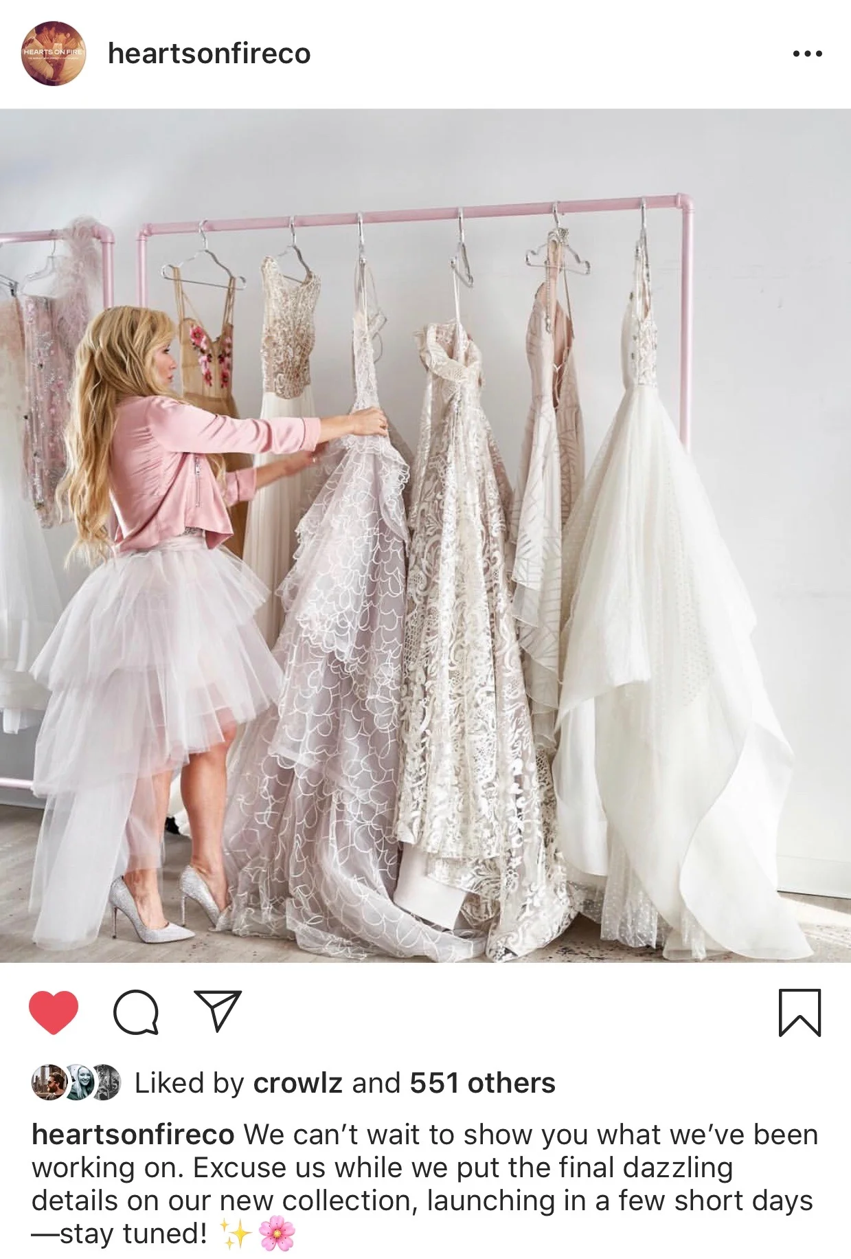
Hayley Paige for Hearts On Fire Hearts On Fire
Hearts On Fire had an opportunity: A partnership with (then) up-and-coming wedding dress designer Hayley Paige, and a chance to freshen up branding that felt dated. Paige's whimsical style gave us a chance to create a bold campaign geared toward younger consumers, especially women purchasing jewelry for themselves. We leaned into the idea of diamonds as art, and away from traditional diamond marketing that insists diamonds are only for marriage and milestones. From mood-board to final voice, I was a leading creative influence, traveling to Paige’s studio in NYC for a two-day photoshoot. I partnered with our creative and art directors, shaping the visual identity and writing all copy to tell the story of a new kind of diamond customer across email, print, in-store, social, and web.